HTML Layout
Page layout is the area of graphic design concerned with the placement of visual components on a page. Page layout is used to improve the appearance of online pages. It determines the overall look, relative significance, and interactions among graphic components in order to generate a fluid flow of information and eye movement for optimum efficacy or impact.
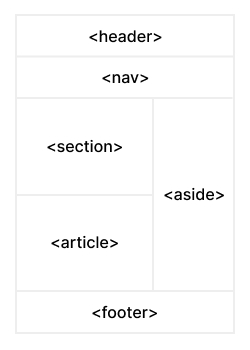
Page layout specifications
-
Header: The section of a front end that appears at the top of the page. The
<header>element is used in web pages to create a header section. - Navigation Bar: is the same as the menu list. It is used to display content information through hyperlinks.
- Index / Sidebar: It contains additional information or adverts that are not necessarily required to be included on the page.
- Content Section: is the major area of the website where the material is shown.
-
Footer: The footer area provides contact information and other web page-related queries. The footer area is always placed at the bottom of web pages. The
<footer>element is used to specify the location of the footer in web pages.
FAQs
When it comes to structuring HTML markup for layout and accessibility, there are several best practices to keep in mind.
Firstly, use semantic HTML elements such as ,
,
,
,
and to define the structure of your page. This helps both screen readers and search engines to understand the content and context of your page.
Secondly, ensure that your HTML markup is well-organized and easy to read, with proper indentation and comments.
Finally, make sure to use appropriate attributes such as alt text for images and labels for form elements, and test your pages with accessibility tools to ensure they are accessible to everyone.
Debugging layout issues in HTML can be a frustrating task, but there are several tools and techniques you can use to identify the cause of problems.
First, use your browser's developer tools to inspect the elements and styles that are affecting the layout. Look for any conflicting styles or missing styles that may be causing the problem.
Next, try removing elements or styles one at a time to see if the problem goes away. This can help you isolate the issue and identify the code that is causing the problem.
You can also use a validator or linter to check your HTML for errors or warnings that may be affecting the layout.
Finally, consider testing your layout on different devices and browsers to ensure it looks and functions correctly across different platforms.
There are several ways to position elements on a web page. The most common ways are:
- Static Positioning: This is the default position for all HTML elements. The element is positioned according to the normal flow of the document.
- Relative Positioning: This position is relative to the normal position. The element can be shifted from its normal position by using the top, bottom, left, and right properties.
- Absolute Positioning: This position is relative to the nearest positioned ancestor element. If no ancestor is positioned, it uses the body element. The element can be positioned by using the top, bottom, left, and right properties.
- Fixed Positioning: This position is relative to the browser window. The element stays in the same place even if the page is scrolled. The element can be positioned by using the top, bottom, left, and right properties.
- Sticky Positioning: This position is a hybrid of relative and fixed positioning. The element is positioned like it is relatively positioned until a certain point and then becomes fixed. It can be positioned by using the top, bottom, left, and right properties.