CSS Box Model
The CSS box model is a container that houses the content as well as other attributes like padding, margins, and borders. It is employed to produce the style and arrangement of web pages.
It serves as a toolset for modifying how various pieces are laid out. According to the CSS box model, the web browser presents each element as a rectangular box.
In CSS, Box-Model has a number of properties. Below are a few of them:
- content: This property is used to show text, images, and other elements that can have their sizes adjusted using the width and height properties.
- padding: This attribute is used to add space inside any defined borders around the element.
- border: This property is used to define the style, colour, and width of the border as well as to cover the content and any padding.
- margin: The border region of an element is surrounded by space created by this attribute.
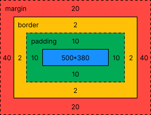
Content Area:Text, photos, and other types of media content can be found in the content area. Its proportions are determined by the content-box width and height, and it is surrounded by the content edge.
Padding Area: It includes the padding for the element. This region actually includes the space inside the border box and around the content area. Its dimensions are determined by the height and width of the padding box.
Border Area: The border region is where the box's padding and margin meet. The border's height and breadth serve as its measurements.
Margin Area: The area between the margin and the border is known as the margin area. The margin-box width and height determine the size of the margin area. Distinguishing the element from its neighbors is helpful.
We must comprehend how the CSS Box model functions in order to specify the width and height properties of an element (to render the content in the browser correctly). Only the content area's width and height have been set while using CSS to set an element's width and height properties. To get an element's complete size, we must include padding, borders, and margins. Consider the illustration below.
The total width for the element can be calculated as:
Total element width = width + left padding + right padding + left border + right border + left margin + right margin
The <p> element can have a total width of 212px.
- 150px (width) +
- 10px (left padding) +
- 10px (right padding) +
- 1px (left border) +
- 1px (right border) +
- 20px (left margin) +
- 20px (right margin) =
- 212px Total Width.
The total height for the element can be calculated as:
Total element height = height + top padding + bottom padding + top border + bottom border + top margin + bottom margin
The <p> element can have a total height of 137px.
- 75px (height) +
- 10px (top padding) +
- 10px (bottom padding) +
- 1px (top border) +
- 1px (bottom border) +
- 20px (top margin) +
- 20px (bottom margin) =
- 137px Total Height.
FAQs
When troubleshooting layout issues with the CSS Box Model, it's important to first understand the Box Model components (content, padding, border, and margin) and how they affect element sizing.
To troubleshoot layout issues, you can use the browser's developer tools to inspect the element and see its box model. This will help you identify any unexpected padding, margin, or border values that may be affecting the layout.
You can also experiment with adjusting the padding, margin, and border values to see how they affect the layout. Additionally, you can use CSS properties like display, position, and float to adjust the element's placement and behavior.
Finally, it's important to ensure that your CSS is properly organized and that selectors are specific enough to target the intended elements.
The CSS Box Model describes how elements are laid out on a web page. content-box is the default value of the box-sizing property, which defines the size of an element as its content plus padding and border. border-box, on the other hand, includes the content, padding, and border within the element's specified width and height. This means that when using border-box, the border and padding are drawn inside of the specified width and height, while with content-box, the border and padding are drawn outside of the specified width and height.
To create equal-sized columns using the Box Model, you can use the CSS flexbox property. First, create a parent container element and give it the display: flex; property. Then, create child elements and give them a flex: 1; property. This will make them expand to fill the available space equally. You can also use justify-content: space-between; or justify-content: space-evenly; to evenly distribute the space between the child elements. Additionally, make sure to set box-sizing: border-box; on all elements to correctly calculate the width and height including padding and border.